Dear Investor,
As a trader and investor, you’re probably familiar with the saying “Sell in May and go away”. It suggests that the stock market’s performance between May and October is generally lackluster compared to the more vibrant months of November to April. But is there any truth to this?
The legend says that the phrase originally came from an old English saying: “Sell in May and go away, and come back on St. Leger’s Day.” This advice was linked to British aristocrats who used to leave the hot city of London during the summer and return after the St. Leger’s Stakes horse race in September. What began as a lifestyle choice for the wealthy has turned into a financial strategy observed in stock markets globally.
Where does the risk or reward lie?
Moving beyond the usual focus on the U.S. stock market, let’s examine the so-called “Halloween Effect”—another term for this seasonal slowdown—in five major global markets, including the U.S.
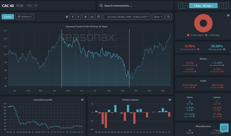
The French Connection: CAC 40
The CAC 40 seasonal chart shows a general trend where the index peaks around May, followed by a decline or flattening out through the summer months. There is a noticeable trough in the middle of the year, which might coincide with the summer holidays in France, where economic activity slows down. The index then picks up towards the end of the year, suggesting a recovery in investor sentiment and market activity.
Seasonal Chart of CAC 40 over the past 25 years
Source: Seasonax, sign up here https://app.seasonax.com/signup to access further analysis, 30 days for free
How to read seasonal charts?
* Unlike regular charts, a seasonal chart doesn’t display price over a set time, but shows the average trend over several years. The horizontal axis represents the time of the year, and the vertical axis shows the % change in price (indexed to 100). The prices reflect end of day prices and do not include daily price fluctuations. The statistics on the right in the charts reflects time period from May 1 until September 30 over the last 25 years.
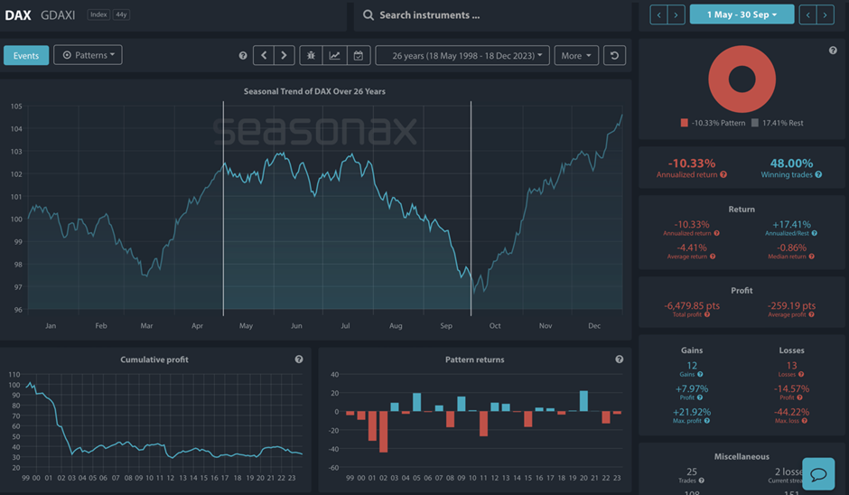
Germany’s Market Rhythms: DAX
The DAX chart exhibits a similar pattern to the CAC 40, with a peak around May. The decline that follows extends through the summer months, which is reflective of Germany’s holiday season and possibly reduced industrial production. The market generally picks up again towards the end of the year, although this is not as pronounced every year, indicating variability in market behavior.
Seasonal Chart of DAX over the past 25 years
Source: Seasonax, sign up here https://app.seasonax.com/signup to access further analysis, 30 days for free
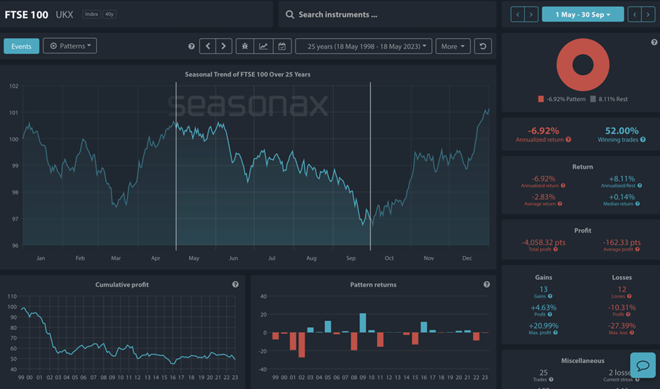
The British Pattern: FTSE 100
The FTSE 100 chart aligns closely with the traditional “Sell in May” hypothesis, showing a marked decrease in the index post-May. This could be influenced by the UK’s vacation habits and fiscal policies. As seen in the chart, the index often recovers as the year ends, which might be related to an increase in trading volumes and economic reports being published.
Seasonal Chart of FTSE 100 over the past 25 years
Source: Seasonax, sign up here https://app.seasonax.com/signup to access further analysis, 30 days for free
The American Pulse: Dow Jones Industrial Average
Across the Atlantic, the Dow Jones Industrial Average presents a slightly different pattern, with less pronounced seasonal dips. The U.S. market shows resilience during the summer months, but does exhibit a small dip around May, followed by a plateau or slight decline, before increasing again towards the year’s end. This could be due to the diverse and more globally integrated nature of the U.S. economy.
Seasonal Chart of Dow Jones over the past 25 years
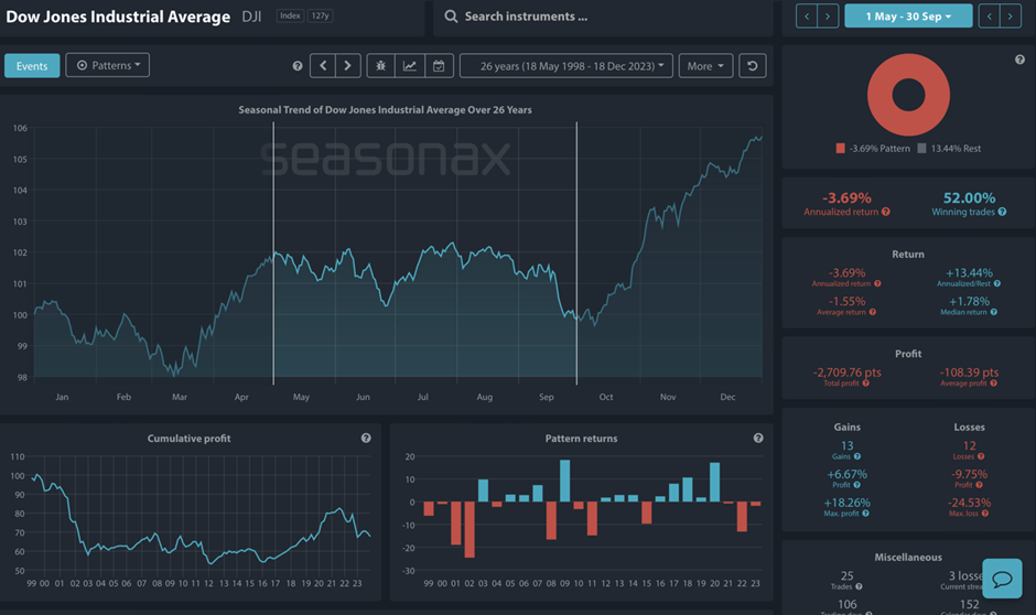
Source: Seasonax, sign up here https://app.seasonax.com/signup to access further analysis, 30 days for free
The Land of the Rising Sun: Nikkei 225
Japan’s Nikkei 225 shows a less clear-cut seasonal pattern, with some years showing declines post-May, while others do not follow this trend as closely. Cultural and economic factors unique to Japan, such as the “Golden Week” holiday and the importance of the manufacturing sector, which may not slow down as much in the summer, could contribute to these differences.
Seasonal Chart of Nikkei 225 over the past 25 years
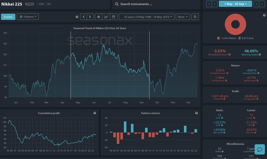
Source: Seasonax, sign up here https://app.seasonax.com/signup to access further analysis, 30 days for free
Reading Between the Charts
By analyzing the seasonal charts of various indices, we find that the average prices during the May to October period indeed show a dip. The FTSE 100, DAX, CAC 40, DOW and even the Nikkei 225 illustrate this seasonal downtrend over the last 25 years. The charts reveal that, while not every year follows the pattern to the letter, there is a noticeable dip in returns during these months.
The “Sell in May” mantra may suggest a bearish half-year. Keep in mind, however, it’s just one piece of the market puzzle. Typically, stocks might not climb as much during these months, but they don’t necessarily plunge.
Are you are interested in defying the downturn? With Seasonax’s Screener, you can discover stocks that thrive during these typically tepid months and improve your trading results.
Test 30 days for free and explore patterns across various markets, including indices, (crypto)currencies, stocks, and commodities.
Remember, don’t just trade it, Seasonax it!
Yours sincerely,
Tea Muratovic
Co-Founder and Managing Partner of Seasonax